Rainbow Play Cafe
Rainbow Play Cafe
Rainbow Play Cafe, a new indoor playground cafe, recognized the need to enhance its online presence after six months in business.
Understanding the importance of a robust digital platform, I was tasked with conducting user research and redesigning the cafe's website to drive business growth and enhance customer interaction.
Timeline
Jan-Mar 2024
Tools
Figma, Survey Monkey
Role
Product designer
Client
Xanat (owner)
Timeline
Jan-Mar 2024
Tools
Figma, Survey Monkey
Role
Product designer
Client
Xanat (owner)
Context
Context
Rainbow Play Cafe's website is an essential tool for customer bookings. However, the website's current design and layout may cause difficulty for customers, resulting in lower sales.
A redesign focusing on intuitive navigation, visual appeal, and seamless integration of a user-friendly booking system promises to streamline reservations and drive higher sales.
Research
Research
Market Research
Market Research
Since I wasn’t familiar with this industry, I conducted market research to optimize the website from both a user and business standpoint. This enabled me to identify key areas for improvement, prioritize features, and ultimately enhance sales and visibility. Additionally, it provided insights into customers' preferences and expectations for the cafe.
Family Indoor Entertainment Centers (FEC)
Popular destination for families, birthday parties, corporate events, and social outings.
These centers help in building various skill sets among children and provide the opportunities to socialize, promote creativity, and ensure active learning.
The increasing prioritization of experiences over material possessions is boosting the demand.
Popular revenue sources: Entry fees, ticket sales, food and beverages, merchandising, and advertisement.
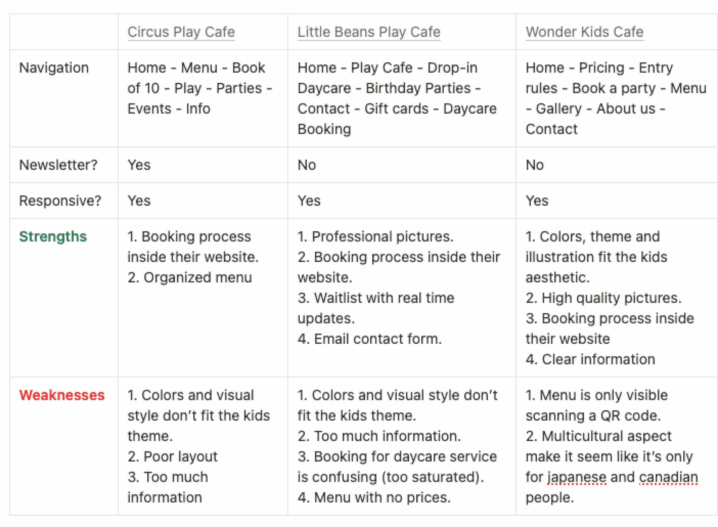
Competitor Analysis
Competitor Analysis
I conducted competitor analysis to understand businesses similar to Rainbow Play Cafe. This helped me compare and learn from their strengths and weaknesses, drawing inspiration and evaluating key processes such as the booking system.
I conducted competitor analysis to understand businesses similar to Rainbow Play Cafe. This helped me compare and learn from their strengths and weaknesses, drawing inspiration and evaluating key processes such as the booking system.
User Persona
User Persona
Based on insights gathered from market research, competitor analysis, social media reviews, and input from Xanat, the owner, I was able to build a user persona.
Based on insights gathered from market research, competitor analysis, social media reviews, and input from Xanat, the owner, I was able to build a user persona.

Jane Moloughney
Jane Moloughney
Jane is a stay-at-home mom from Vancouver, BC. She has a 3-year-old daughter named Chloe. She's looking for new activities that both she and her baby can enjoy, while spending some quality time together.
Jane is a stay-at-home mom from Vancouver, BC. She has a 3-year-old daughter named Chloe. She's looking for new activities that both she and her baby can enjoy, while spending some quality time together.
💪 Goals:
Prioritize parenting responsibilities while seeking enjoyable family activities.
Seek opportunities for socializing with other parents and families.
Desire to facilitate early childhood stimulation and development.
Find indoor activities that are both entertaining and beneficial for their child's growth and development.
⚠️ Frustrations:
Balancing her parenting responsibilities with her other interests and commitments.
The lack of clean and safe places for her child to play, and the cost of the existing ones.
Finding indoor activities that are suitable for children of various ages, backgrounds, and ethnicities.
⚠️ Frustrations:
Balancing her parenting responsibilities with her other interests and commitments.
The lack of clean and safe places for her child to play, and the cost of the existing ones.
Finding indoor activities that are suitable for children of various ages, backgrounds, and ethnicities.
Lab Usability Testing
Lab Usability Testing
I had asked volunteers to complete a series of tasks that a potential customer of Rainbow Play Cafe would carry out. Throughout this process, I closely observed their expectations, desires, and frustrations. This exercise aimed to provide insights into potential issues users might face while navigating the website.
I had asked volunteers to complete a series of tasks that a potential customer of Rainbow Play Cafe would carry out. Throughout this process, I closely observed their expectations, desires, and frustrations. This exercise aimed to provide insights into potential issues users might face while navigating the website.
Customer Journey - Booking a visit for Sunday
Customer Journey - Booking a visit for Sunday
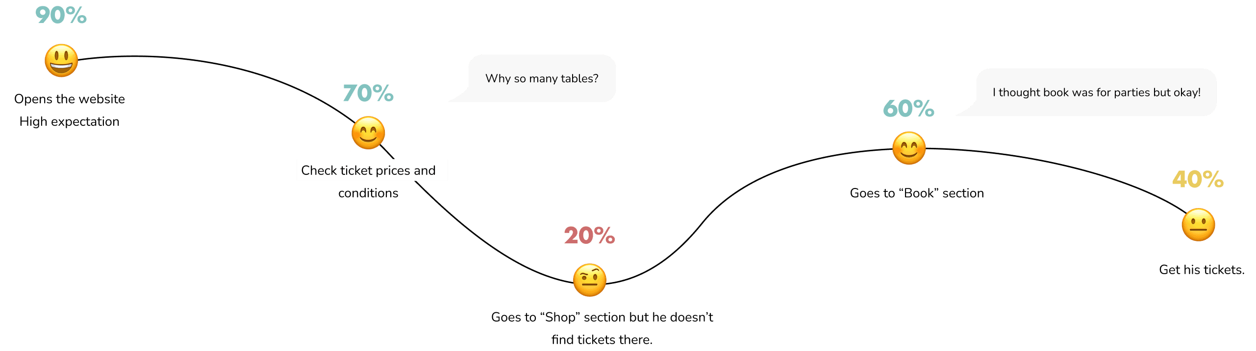
Insights
Insights
01
01
Confusing Information Architecture: Users are confused by how information is organized, like mixing up "book" and "shop," or "parties" and "activities." This makes it hard to find what they're looking for.
Confusing Information Architecture: Users are confused by how information is organized, like mixing up "book" and "shop," or "parties" and "activities." This makes it hard to find what they're looking for.
02
02
Information Overload: The website presents oversaturated information, making it overwhelming for users. Both simple and complex information are presented in a heavy-to-read manner.
Information Overload: The website presents oversaturated information, making it overwhelming for users. Both simple and complex information are presented in a heavy-to-read manner.
03
03
Missing Pictures: There aren't enough pictures showing what the cafe looks like. People like to see pictures before deciding to visit a new place.
Missing Pictures: There aren't enough pictures showing what the cafe looks like. People like to see pictures before deciding to visit a new place.
04
04
Not Kid-Friendly: The website doesn't look like it's for kids. It has dark colors and fancy fonts that make it seem too serious or old-fashioned, not fun and friendly like it should be..
Not Kid-Friendly: The website doesn't look like it's for kids. It has dark colors and fancy fonts that make it seem too serious or old-fashioned, not fun and friendly like it should be..
Lab Usability Testing
Lab Usability Testing

Ideation
Ideation
Website Analysis & Ideation
Website Analysis & Ideation
I chose to annotate specific areas of the website requiring improvement, while also noting elements I intended to maintain or introducing new ideas.
I chose to annotate specific areas of the website requiring improvement, while also noting elements I intended to maintain or introducing new ideas.
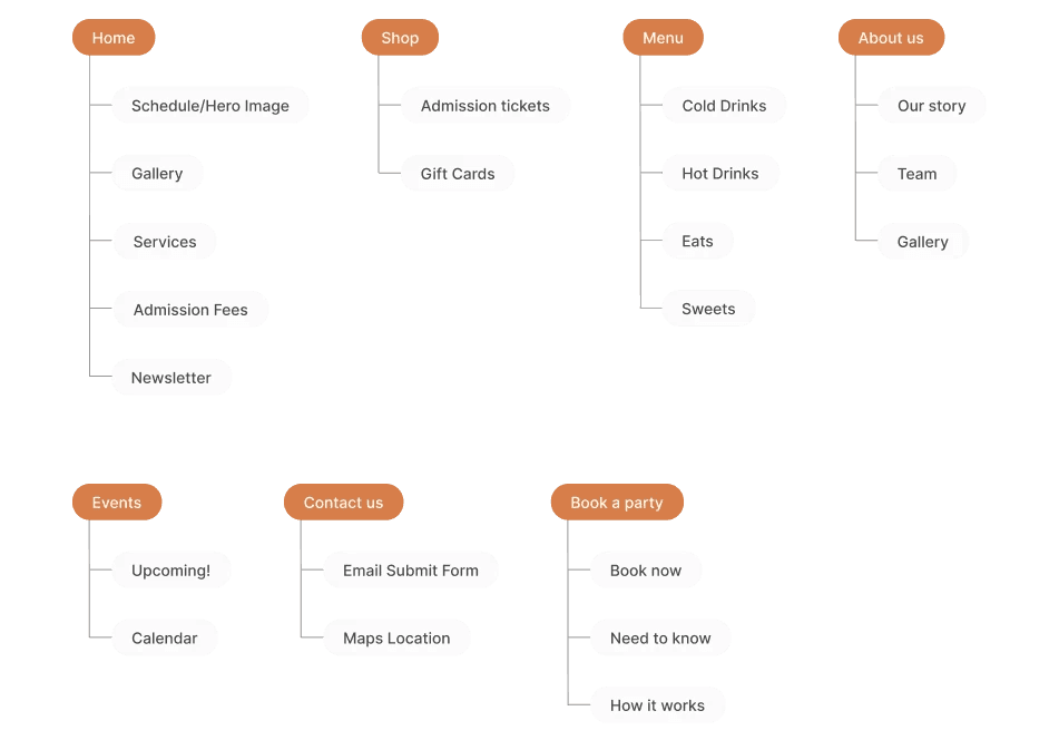
Information Architecture
Information Architecture
Drawing from previous insights, I focused on enhancing the information architecture of the page to ensure a more intuitive user experience. Additionally, I followed the flow of other cafe websites to create a sense of familiarity for users.
Drawing from previous insights, I focused on enhancing the information architecture of the page to ensure a more intuitive user experience. Additionally, I followed the flow of other cafe websites to create a sense of familiarity for users.
Design
Design
Wireframes & Mockups
Wireframes & Mockups
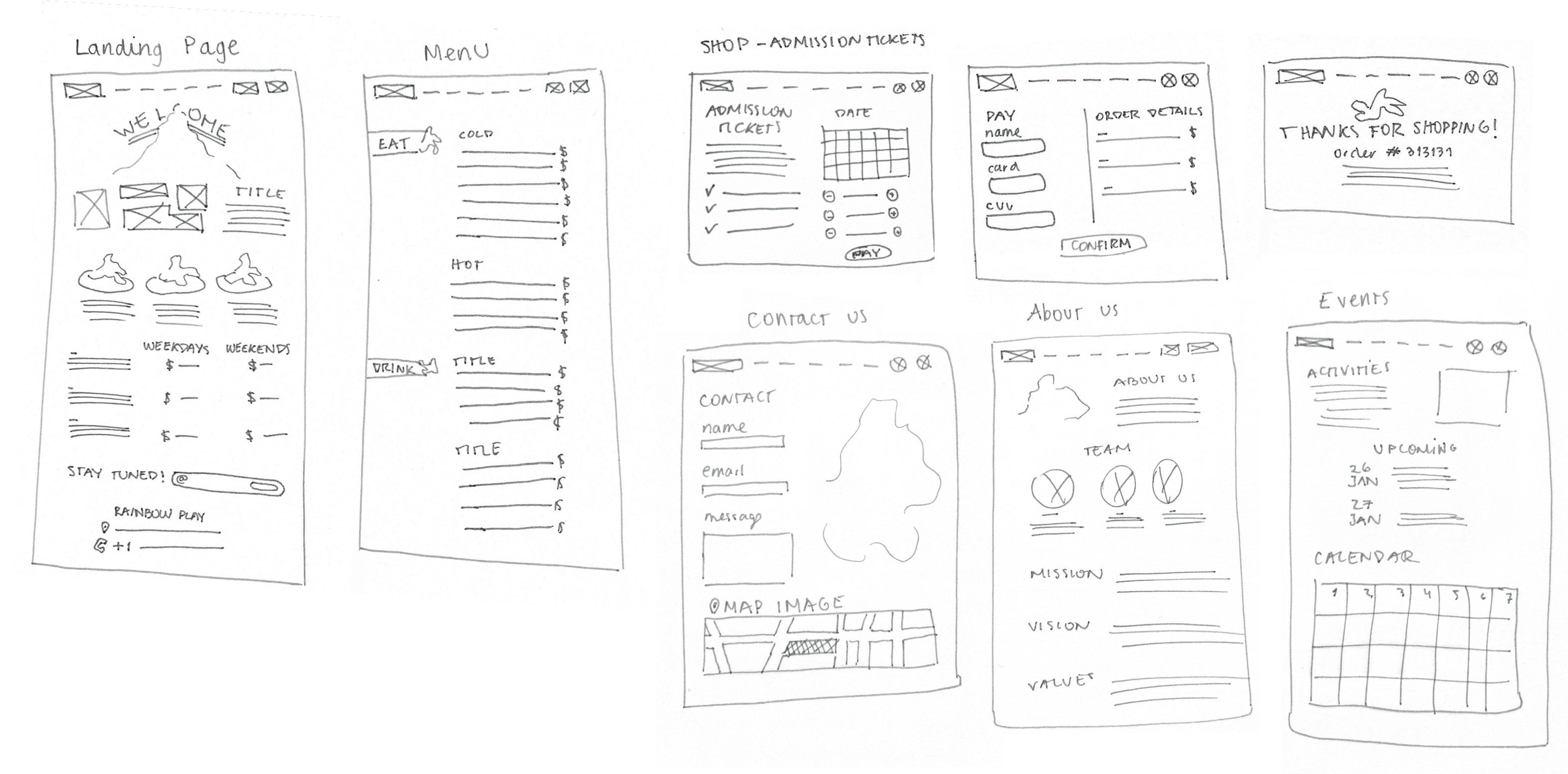
I started with low-fidelity wireframes that were later transformed into high-fidelity ones.
My main challenge was balancing creativity with practicality, ensuring my ideas were realistic in terms of proportions, consistency, and the availability of visual resources.
To achieve this iteration played an important role.
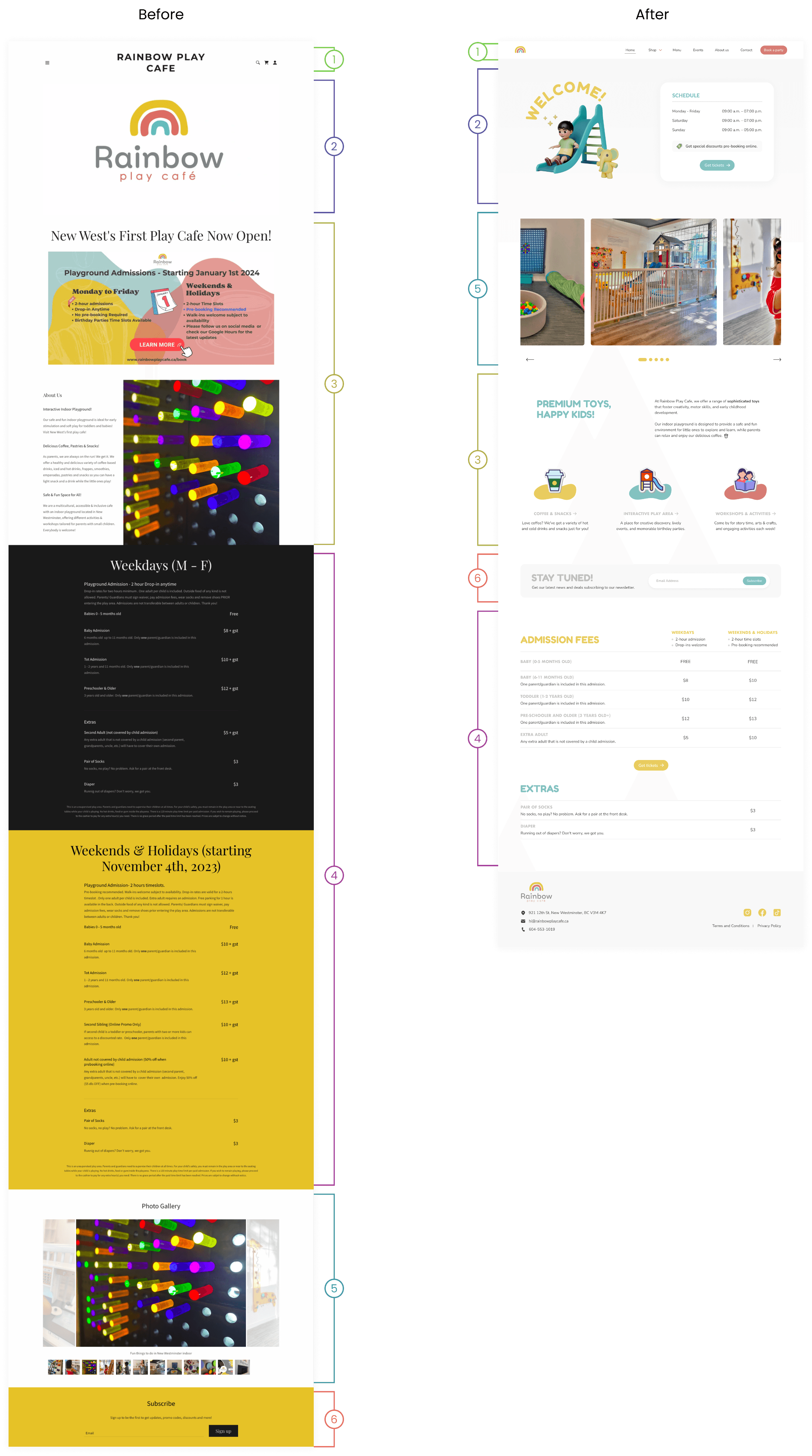
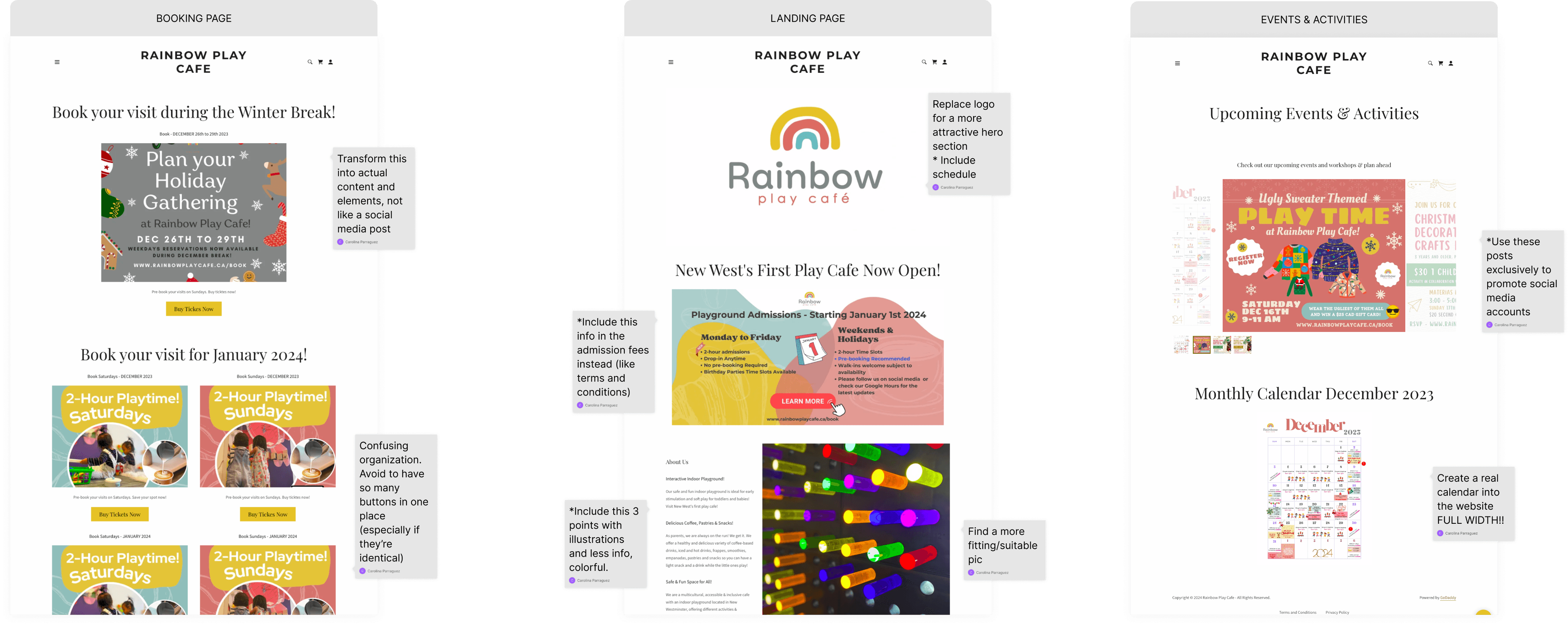
Landing page - Redesign Analysis
Landing page - Redesign Analysis
Navigation Bar
All the pages displayed for easy content access.
Highlighted Red Call-to-Action Button.
Purchasing icons were deleted since all the purchases are made outside of the website (in Simpletix)
Hero Section
Given that the top reason for calls to the café revolves around the schedule, I placed it at the beginning, accompanied by a call-to-action button for purchasing tickets and emphasizing the online offer.
Instant warm atmosphere with a kid playing illustration and welcome sign.
Services/About Us info
A brief description of the cafe and its main qualities is mentioned to convince users.
Colorful stickers placed as a visual compliment
Admission fees
Turned the “week table” and the “weekend table” into a single one.
Photo Gallery
Replaced near the front for higher visibility and added automatic scroll.
Newsletter
Replaced near the middle of the page for higher visibility.
Change “Subscribe” to “Stay tuned!” to add excitement and anticipation for exclusive news.
Prototype Walkthrough
Prototype Walkthrough
Testing
Testing
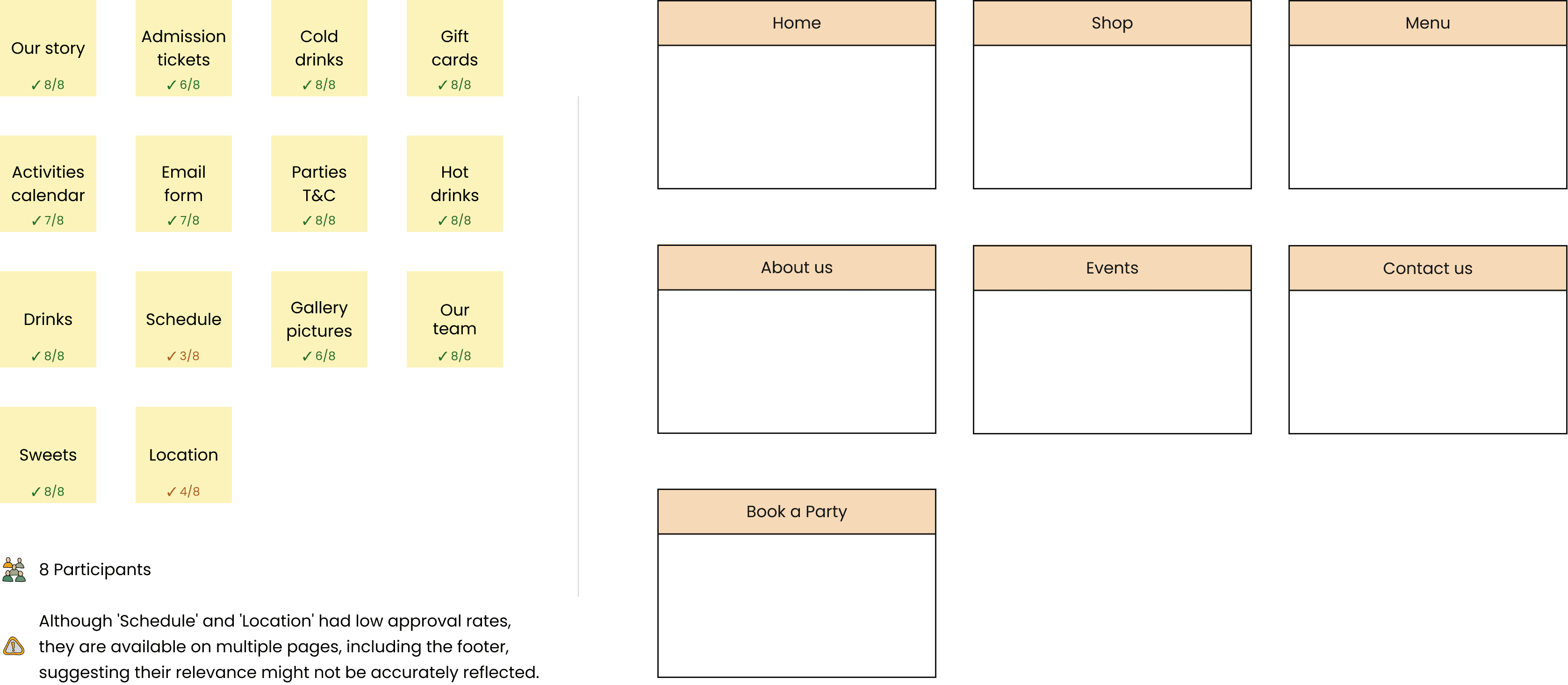
Card Sorting
Card Sorting
When presenting the prototype to the client, the main feedback from all teams was about the information architecture. So, I wanted to see if the way I structured the information worked effectively.
I went with card sorting because it's easy for users and doesn't take too much time.
When presenting the prototype to the client, the main feedback from all teams was about the information architecture. So, I wanted to see if the way I structured the information worked effectively.
I went with card sorting because it's easy for users and doesn't take too much time.
What I learned..
What I learned..
Working on a real project brought to light the importance of balancing user needs with business objectives. It was crucial to consider both the perspectives of the parents/families planning to visit the café and the owner's goals for increasing sales/bookings. My main focus was ensuring that every design decision benefited both parties.
Additionally, I made sure to test and validate my assumptions to ensure their accuracy. Since it was a real project, there was no room for guesswork or assumptions—I needed concrete evidence to guide our decisions.